SUTD Beamer Theme

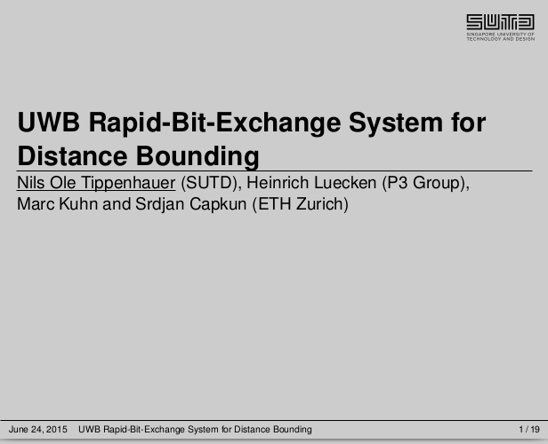
For teaching and other presentations, I tend to use LaTeX+ beamer. Unfortunately, the default beamer themes are in my opinion all somewhat overloaded and outdated. I spent some time to built two themes for personal use, I call them the SUTD light and SUTD dark theme. The light theme is black font on light grey background, with maroon highlights. The dark theme is white text on dark grey background, with maroon highlights. The main focus is on simplicity – putting only a minimal amount of information on each slide, without wasting space. By default, both themes also include the SUTD logo. The following is an example of a title slide.

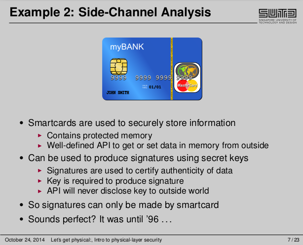
Another example, showing the different bullet point levels

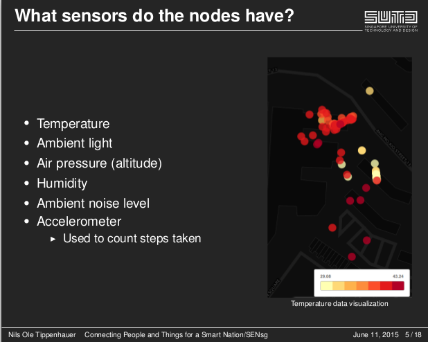
And an example of the dark theme

The following information is put automatically in header/footer:
- Slide title (header)
- Author name (footer)
- Talk title (footer)
- Date (footer)
- Page number (footer)
The theme can be found on Github. I am looking forward to comments and feedback!